Guide to BEM naming convention to CSS

I'm a software engineer with capabilities for doing application design and software development with several technologies and frameworks. I’m a friendly, organized, responsible person, always focused on achieving the best results, I have clear goals and a great determination to overcome any obstacle that may arise. Always excited about learning and working with newer technologies and methodologies that allow me to create better software solutions and grow professionally.
When working on a software project, organizing the styles isn't usually a big deal. You get in there, write some CSS, or maybe even some SASS. You compile it all into a stylesheet file and from import or use in your website.
However, when it comes to larger, more complex projects, how you organize your code is the key to efficiency in at least these three ways:
- How long it takes you to write code.
- How much of that code you’ll have to write.
- How much loading your browser will have to do.
This becomes especially important when you’re working on different themes for our website, in addition, today we have several features that can be integrated into our application like the Dark Mode that can be very useful for our clients and the market objective that we seek.
There are some mythologies that we can use in our projects like OOCSS, SMACSS, SUITCSS, Atomic, and BEM. This post will explain the main idea with the BEM naming convention as some examples
BEM
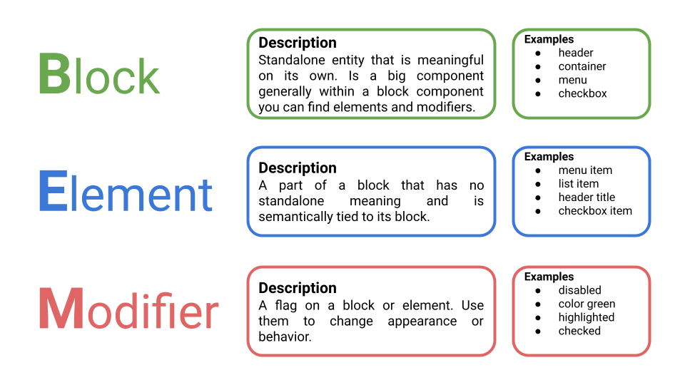
BEM is an abbreviation for Block, Element, and Modifier. is a methodology highly useful, powerful, and simple CSS naming convention that makes your front-end code easier to read and understand.
BEM Benefits
- Modularity: Block styles are never dependent on other elements on a page, so you will never experience problems from cascading.
- Reusability: Composing independent blocks in different ways, and reusing them intelligently, reduces the amount of CSS code that you will have to maintain.
- Structure: BEM methodology gives your CSS code a solid structure that remains simple and easy to understand.
Why use BEM?
- It helps to avoid style conflicts. As every class needs to be isolated and not depend on one another we avoid the conflicts between CSS classes.
- It sets a consistency on a codebase. A good standardization in a project could help to produce easy maintainability and readability.
- It is a communicative methodology:
- Component structure: Basically, when is needed to add new styles for an element in our application, you may find that there is a pre-existing modifier that already exists that does what we need or create the new one.
- Purpose or function: it easy to quickly get an idea of which element depends on another.
How to use BEM?
Block
Encapsulates a standalone entity that is meaningful on its own. While blocks can be nested and interact with each other, semantically they remain equal; there is no precedence or hierarchy. Holistic entities without DOM representation (such as controllers or models) can be blocks as well.
Naming
Block names may consist of Latin letters, digits, and dashes. To form a CSS class, add a short prefix for namespacing for example: .block, .form, .container.
- Use class name selector only.
- No tag name or ids.
- No dependency on other blocks/elements on a page.
Example
.block { color: #042; }
<div class="block">...</div>
Element
Parts of a block and have no standalone meaning. Any element is semantically tied to its block.
Naming
Element names may consist of Latin letters, digits, dashes, and underscores. CSS class is formed as block name plus two underscores plus element name for example: .block__elem, .form__elem, .container__elem.
- Use class name selector only.
- No tag name or ids.
- No dependency on other blocks/elements on a page.
Example
<div class="block">
      <span class="block__elem"></span>
</div>
.block__elem { color: #042; }
Modifier
Flags on blocks or elements. Use them to change appearance, behavior, or state.
Naming
Modifier names may consist of Latin letters, digits, dashes, and underscores. CSS class is formed as block’s or element’s name plus two dashes: .block--mod or .block__elem--mod and .block--color-black with .block--color-red. Spaces in complicated modifiers are replaced by a dash.
Code
<div class="block block--size-big">
  <h1 class="block__title block__title--color-red">Example title</h1>
</div>
.block {
  background: #efefef;
  margin 2px;
  width: 200px;
  height: auto;
}

.block--size-big {
  width: 600px;
  height: auto;
}

.block__title {
  font-size: 14px;
  text-align: center;
}

.block__title--color-red {
  color: red;
}
BEM Button Example
A common example where we can use BEM could be when we apply styles for the button theming so we can have a normal button class for usual cases and use modifiers for the other variants or states.
CSS Styles
.button {
  display: inline-block;
  border-radius: 0.25rem;
  padding: 0.4375rem 0.75rem;
  border: 0.125rem solid #d5d5d5;
  background: #efefef;
  font: 700 13px/18px Helvetica, arial;
}

.button--variant-primary {
  background: #0313fc;
  border-color: #0c1adb;
  color: #fff;
}

.button--variant-secondary {
  color: #0313fc;
  border-color: #0313fc;
}

.button--variant-danger {
  background: #900;
  border-color: #8d0c0c;
  color: #fff;
}
As you can see there is a CSS class for the default state called button and in the case of the others is using modifiers button--variant-primary, button--variant-secondary, button--variant-danger.
HTML Code
For this example, were used some button HTML tags. Basically when we need to use the common button styles could just use the base class button and in the case of the other states need to be used the base button class and class related to the specific variant button that wants to be used.
<button class="button">Default</button>
<button class="button button--variant-primary">Primary</button>
<button class="button button--variant-secondary">Secondary</button>
<button class="button button--variant-danger">Danger</button>
Sass and BEM
An awesome feature that is used when have been integrated Sass into our project is the nesting Sass feature with that we can write nesting styles, but get CSS that isn’t nested. Creating new CSS classes that are using BEM most easily.
Example
.block {
    &__title {
        display: inline-block;
        margin: 0.5rem 0 1rem;
        padding: 0.125rem 0.25rem;
        font-size: 0.625rem;
        font-weight: bold;
        background-color: #ffeae3;
    }
    &__declined {
        background-color: #e6fff6;
    }
    &__info {
        margin-bottom: 0.5rem;
    }
}
Output
.block__canceled-title {
     display: inline-block;
     margin: 0.5rem 0 1rem;
     padding: 0.125rem 0.25rem;
     font-size: 0.625rem;
     font-weight: bold;
     background-color: #ffeae3;
}

.block__declined {
     background-color: #e6fff6;
}

.block__info {
     margin-bottom: 0.5rem;
}
In the case that you want to check you can use the jsonformatter.org webpage to convert Sass to CSS.
Conclusion
As you see BEM provides some awesome features that can be used in our projects and also could be applied when are encountering naming CSS difficulties.
To be honest, could be difficult and It may seem strange at first, but after some time with constant practice, you will be an expert using BEM in your projects.
I hope you find this article really helpful in avoiding common mistakes when naming. I will be updating this post based on your comments and recommendations so let me know in any case. Thanks! 👍


