


When are working on a project with technologies like React, Angular and Vue the main idea is to create modular systems using components, but that doesn't usually include a good way to see them all from a higher point of view because to see some of them probably will need to do some complex steps or need some specific information stored in the system.
Storybook will help us do that in an easier way. During this post, we will see how can be used in our React project and some of the benefits of this approach.
What is Storybook?
Storybook is the most popular UI component development tool for React, Vue, and Angular. It helps you develop and design UI components outside your app in an isolated environment. Learn Storybook to create bulletproof UI components, along the way you’ll build an app UI from scratch.
As you see Storybook is an awesome tool that allows us to create and work on our application components in an isolated way, so we don't need to execute our entire app and probably the complex steps needed to see the component that we want to change.
What are we going to do during this post?
We are going to create a new React application using the npm create-react-app package. After that, we will install Storybook and create some new components with the help of Storybook.
Create the React App
npx create-react-app react-storybook-example
Note: The directory name can be changed as you want
Once that's finished running and was installed all the dependencies, you can navigate to the directory react-storybook-example
Setup Storybook
To setup Storybook in our React project, we need to execute just the next command
npx -p @storybook/cli sb init
Once this command finishes all the dependencies will be installed in our project. To start the Storybook we just need to execute the command
npm run storybook
After that, the Storybook will be open in the browser and will look similar to
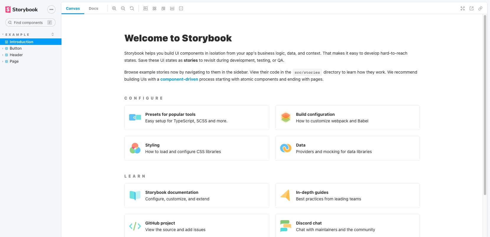
As you see was created some components were during the Storybook setup as for example Button, Header, and Page. We need to delete the default stories created during the Storybook setup.
Creating a new component
We need to create a new directory under src, create a new folder called components.
Header.css
In this file, we add the styles related to our Header component
.header {
    font-family: sans-serif;
    border-bottom: solid 2px black;
    padding-bottom: .2em;
}
Header.js
In this file, we add the main code related to our Header component
import React from 'react';
import './Header.css';

const Header = ({ content }) => {
  return (
    <h1 className="header">
      { content }
    </h1>
  )
}

export default Header;
Header.stories.js
This file is the story file of our component
import React from 'react';

import Header from './Header';

export default {
  title: 'Header',
  component: Header,
};

export const Default = () => <Header content="Default Header"/>;
There is some stuff that is important in this file:
- export default: The first thing we export is a default object. With Storybook, it expects the default export to be the configuration of our story, so here we provide it with a title and we pass in the component that we're using for this story
- export const Default: With Storybook, any non-default export will be considered a variation that will get nested under the title that you provide in the default export.
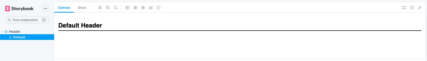
Once start our Storybook with the command npm run storybook we will see something like.
Using the new component
Next, inside of src/App.js, let's import our new component and start to use
App.js
import logo from './logo.svg';
import './App.css';
import Header from './components/Header';

const App = () => {
  return (
    <div className="App">
      <header className="App-header">
        <Header content="The Header was created with help of Storybook"></Header>
        <img src={logo} className="App-logo" alt="logo" />
      </header>
    </div>
  );
}

export default App;
When you start the project with the command npm start you could see something

Conclusion
Storybook is an awesome tool that we can use our React project that will allow us a good way to see them all from a higher point of view.
Let me know in the comments recommendations or something else that can be added, I will update the post based on that thanks! 👍
